Data visualization (data viz) means representing complex data visually, to help people understand it and use it to make decisions. So how do you get started to create your first data visualization?
We have 4 steps to help you start off on the right foot with your data visualization, to then move on to data storytelling, the art of telling a story through data.
Step 1: Identify the context and the audience for your data visualization
Before looking at tools and choice of graphics to create your data visualization, the first step in the process is clarifying the context and the audience. You won’t use the same data or the same type of design to present information to your team in-house as you will to convince decision-makers to invest in a project or to educate the general public about complex issues.
In a broader sense, data visualization can help companies get value from exploding volumes of data, as data analysis becomes more and more accessible. A good data visualization gives them a simple way to share and explain the lessons learned from complex analyses. This way, they can identify new business opportunities or build dashboards to help steer the company.
Step 2: Choose your data
We recommend using your data as your starting point, to explore which of the many data visualization formats and charts will best highlight it. There are many data visualization formats, and it isn’t always easy to know which one to choose.
Many different chart formats have been thought up (scatter plots, pyramid charts, proportional symbol maps, etc.), but the three most common and (over)used charts continue to be time series plots, histograms (bar charts) and circle graphs (the notorious “pie charts”). These formats, however, are not always the easiest to read.
Other charts are better suited to presenting numerical data, categories, mixes of data and categories, maps, network diagrams (well known in project management) or timeline charts. You can even combine different formats to create yours.

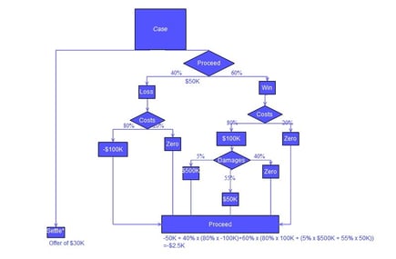
To help you make the right data visualization choice based on the type of data, you can use the “From Data to Viz” decision tree. This free online tool is actually a data visualization itself; it helps you make decisions by providing a graphic representation of the possible choices in the shape of a symbolized tree, with each branch leading to a different choice.
Step 3: Fine-tune your format selection based on your needs
You can also fine-tune your selection based on your needs, the goal of your data visualization. You can do this by answering one simple question: “What would you like to show with your data?”
This is the approach recommended in the “Extreme presentation” method, developed by specialists in marketing and presenting complex data. The method presents 4 possible choices (with another very helpful decision tree). Multiple graphic options are possible depending on whether you want to show a data comparison, a relationship (with connections or correlations), a composition (the parts of a whole and how they change), or a data distribution (with specific cases and trends).
You can also explore Microsoft Appsource, which offers a large library of data visualizations, tested and approved by the publisher to be integrated into its “Power BI” Business Intelligence tools. The main BI solutions will guide you towards the right visual representation for complex subjects.
Step 4: Adapt the data visualization design for the user experience, including mobile

Photo by Adeolu Eletu on Unsplash
An effective data visualization should be simple and accessible, including for mobile users viewing it from their cell phone or tablet. Beyond design work to produce dynamic, visually “attractive” infographics, you should also consider the user experience design (UX design). For example, understanding what volume of information and graphic size are best viewed on smaller screens.
You can find inspiration on graphic design sites such as Data Viz Project, which offer a selection of attractive, easy-to-read graphics. Our teams also develop this type of data visualization by combining their understanding of data challenges with their expertise in current design practices.
In conclusion :
Before you start creating your data visualizations, you should first ask yourself the right questions about the type of data you’re working with and the message that it can communicate. You can take things a step further and make your data tell a story with data storytelling.
If you would like to learn more about our Data Visualization and data storytelling solutions, contact us here.


